Mepps
brief
DigiSage co-owners Bob Lindner and Tim Lindner developed the very first Mepps and Mister Twister website in 1997, when Sheldons’ Inc. approached Tim with an idea for putting their fishing lure products on the web. Since then, DigiSage has developed every iteration of the Mepps and Mister Twister online stores. Over the years, the technology has gotten far more sophisticated, and the sites have kept pace.
Key Features
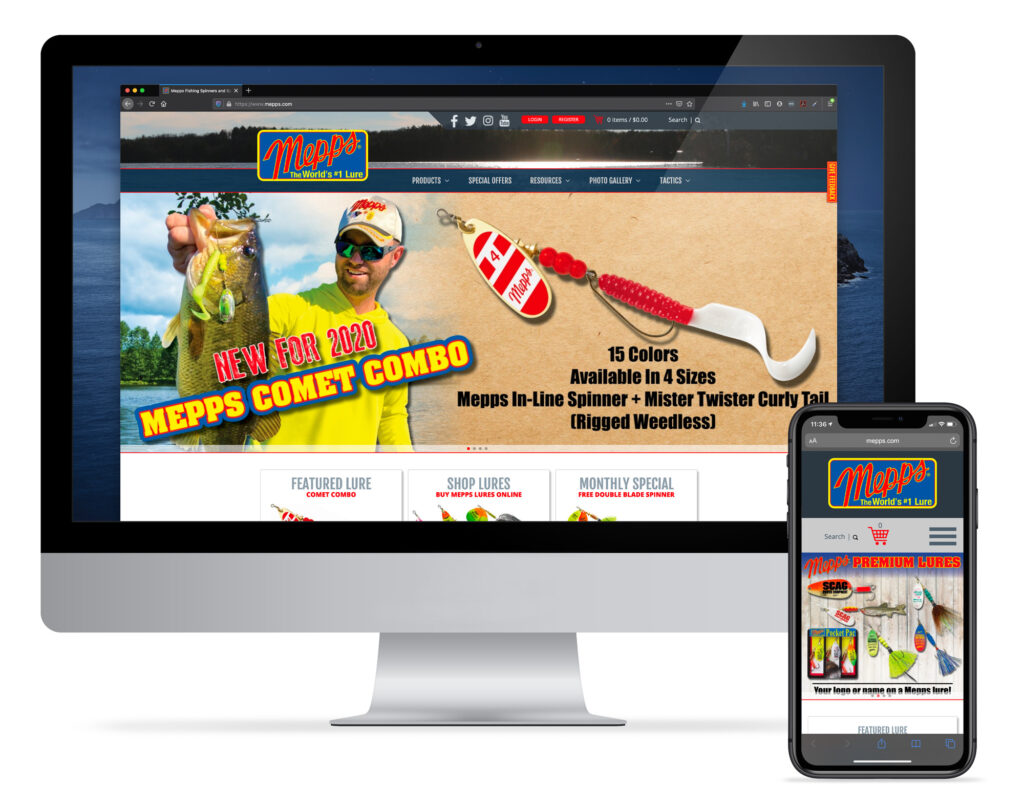
The websites share a design, though each are branded according to their own individual brand standards with different logos and color schemes. The home pages feature vivid product photography which instantly grabs visitors’ attention. Home page elements such as featured products, specials, and informative content are displayed in a grid-style layout, which allows us to offer a number of options for visitors without cluttering the design.
Shoppers are able to easily search for the product they want using a robust search function or by entering the stock number from the catalog, or can browse products by category or type of fish. Checkout is fast and easy, even from a smartphone. According to one customer, “Well made site. Even an old man has no trouble.”
Mepps and Mister Twister use a content marketing strategy that relies on content from pro anglers and hobby fishermen alike. The sites feature user-submitted photos (along with the accompanying stories of how the fish were caught!), instructional articles, and lure selection tips. The Mepps site also includes a hashtag aggregator, which pulls in all posts from Instagram tagged with the hashtag “MeppsCatch,” which are then moderated and posted to the website in a feed. This, along with an active social media presence on Facebook, Twitter, and Instagram encourages a sense of community and camaraderie among customers.
Services Provided
- Website
Website


