La Crosse Area Community Foundation
brief
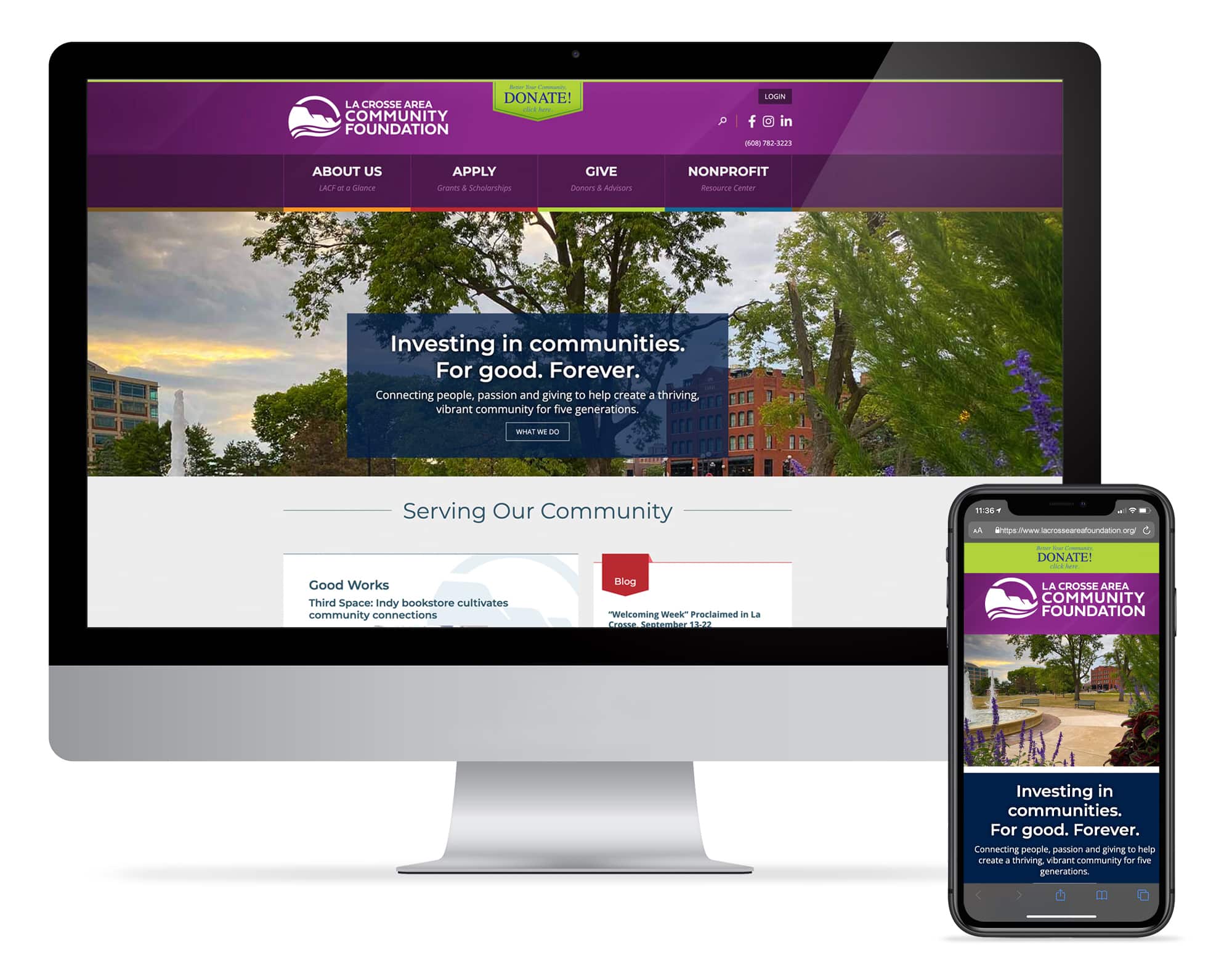
La Crosse Area Community Foundation was looking for a marketing partner that could revamp their website, giving it a new aesthetic that would appeal to all generations, and making it mobile friendly and easier to navigate. In addition, they wanted help creating a beautiful, compelling, and easy-to-read annual report.
The Foundation was attracted to DigiSage’s proposed solution: an easy-to-manage WordPress site, coupled with DigiSage’s design and web development experience, extensive portfolio, mission-driven culture, and affordable rates.
In 2024, the La Crosse Community Foundation rebranded itself as La Crosse Area Community Foundation to better encompass its role in the greater La Crosse area, not just the city of La Crosse.
Goals
Working collaboratively with the Foundation’s staff, we agreed on key goals for the new website:
- Build brand awareness by driving more online interactions and increasing the time spent on the site
- Increase online giving
- Provide a great user experience, as evidenced by positive feedback from users
To meet these goals, the site needed to be:
- Easy for internal staff to complete most of the updates on their own
- Mobile friendly
- Appealing to all generations; including the Foundation’s target audiences of prospective donors, current donors, grantseekers, and financial advisors
- Better organized and easy to navigate
- Optimized for search (SEO – search engine optimization)
- Interactive, with the option for visitors to easily donate online
- Dynamic, with the home page automatically featuring new posts about news and events
Key Features
- DigiSage developed a fresh, vibrant new look for website, while staying true to the well-established La Crosse Community Foundation brand
- On the home page, visitors are quickly invited to learn more about the Foundation, browse the Foundation’s funds, and learn about ways to give; or to read about current news and events, featured donor stories, a featured grant story, or recent grant recipients
- The home page is regularly updated with fresh information, which encourages repeat visits.
- A prominent “Donate” call-to-action button is shown on every page of the site and follows the user down the page as they scroll, making it easy for visitors to complete a donation
- Intuitive and easy-to-find login links were placed in the top right corner of the site, on every page. These allow board and committee members to log in and view meeting minutes, agendas, and other files; fundholders to log in and view their fund statements or make a donor advisor grant recommendation; and applicants and grantees to access the third party grant portal
- The site was also optimized for mobile, speed, and search engines
Services Provided
- Design
- Logo
- Website
Results
Organic Search Increased
New Users Increased
Time on Site Increased
Annual Report
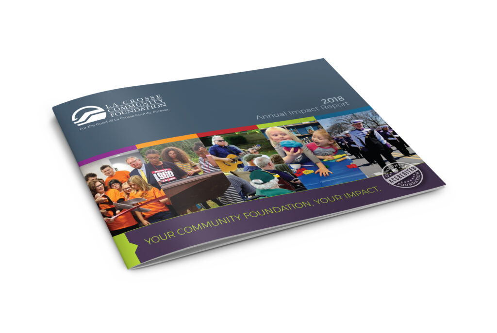
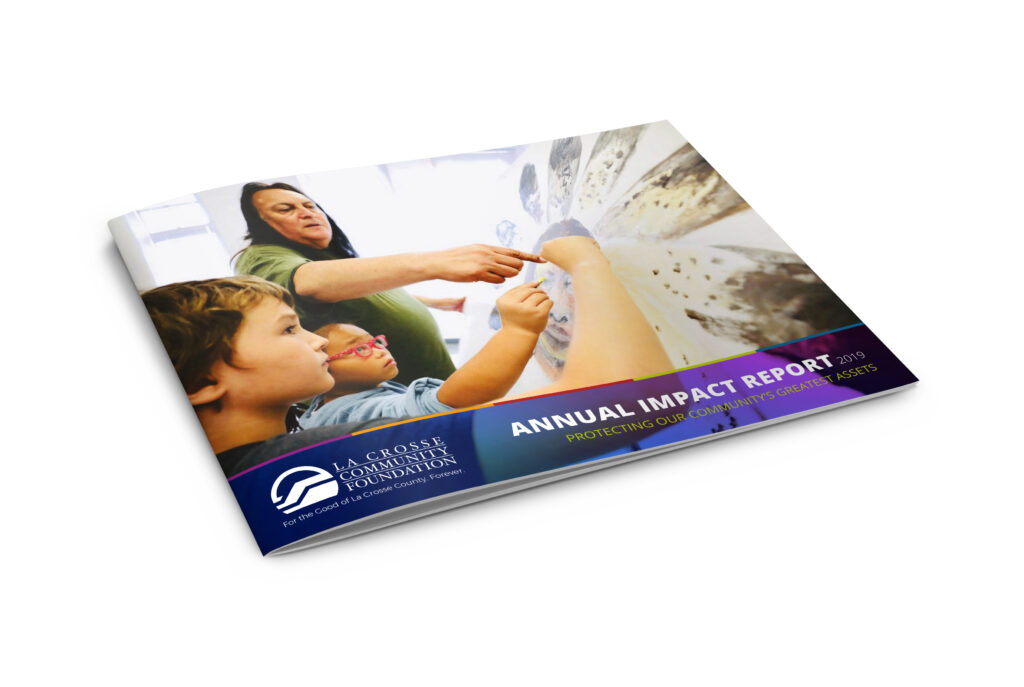
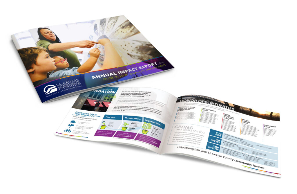
La Crosse Area Community Foundation solicited DigiSage’s help in designing the organization’s 2018 and 2019 annual reports. The annual report is mailed to donors, fundholders, and other community stakeholders, and is also used as the Foundation’s general brochure / main collateral piece throughout the year. It’s meant to communicate the Foundation’s mission, updates about their projects and accomplishments throughout the year. Each year, our goal was to make the annual report visually engaging, easy to read, and to convey a strong message about the benefits of supporting the Foundation.
Design
Logos
Website
